![]()
Death by PowerPoint
 Have you ever been trapped in a room where someone is giving a long boring sales presentation? The sales person drones on and on about their company, their product, their features without even taking a breath. They read slide after slide of bullets with few visuals, and the graphics they do include are so complicated and abstract that they make no sense. There’s no room for conversation, no time for engaging the customer in conversation, no needs discovery, and certainly no collaboration. The experience leaves the audience bewildered and confused instead of inspired and excited.
One good way to avoid death by powerpoint is to involve the audience in the presentation process. There’s a great article on opening the floor to questions throughout the presentation by Roger Dooley at the Forbes website.
It’s Not About You, It’s About the Audience
Most sales presentations are incredibly self-centered. They start out with a company slide filled with stats, followed by a logo slide of all their customers, followed by a series focused on their products. This generic slide deck gets used with every customer, customizing only the agenda page and maybe one or two slides about the customer need.
A better approach is to focus the presentation on the audience, making them the hero of the story. In her book Resonate, Nancy Duarte points out that the presenter is not the hero, he or she is the mentor helping the hero save the day. “You’re Yoda, not Luke Skywalker.” She goes on to say, “You’re simply one voice helping them get unstuck in their journey.”
John Knuff, the General Manager of Global Financial Services at Equinix is particularly skilled at this. A few years ago, he asked us to help him make several slide decks, each focused on niches in the financial services industry. He created separate custom presentations for exchanges, financial technology vendors, and broker-dealers; focusing each sales deck on the specific business needs of that niche market. The slides aren’t about Equinix. They’re about solving real business problems that are common to that niche. Then John and his team further customize the decks for every individual prospect, based on what they already know about that particular customer’s situation and needs.
Stories Help Customers Discover Their Own Needs
It’s critical to craft a message that will resonate with your audience. While making sure the business problems you’re addressing are relevant, it’s also important to incorporate related stories. Stories convey meaning and help your audience emotionally connect with the content. Stories help make abstract concepts more concrete, and they help the customer discover their own story.
This works like a charm when I’m selling PropelGrowth services. Like financial services technology, marketing strategy can be abstract, and if I talk too much in the abstract, I end up confusing the audience. But if I tell stories about how we’ve helped other clients, the listener almost always responds with fresh ideas for how they can benefit from our services, and those ideas are rarely directly related to the story I just told.
Audience attention spans are short, so to keep them engaged, it’s best to structure your presentation into 10-minute chunks, and incorporate a story in each chunk to illustrate that concept.
Good Graphic Design is Critical to Conveying Meaning
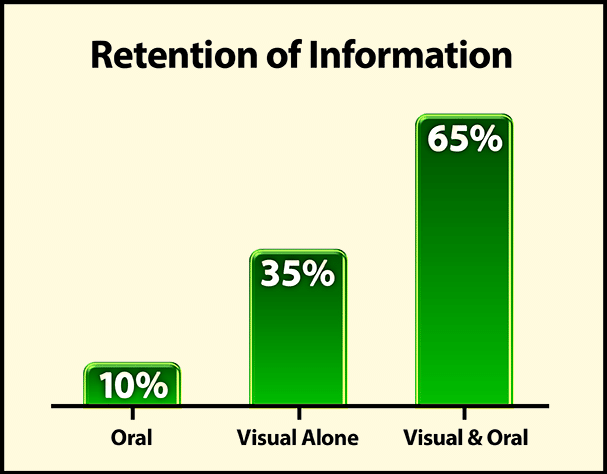
If information is presented in bullet form with oral comment, typically only 10% is remembered after 3 days. But if you add meaningful pictures, images and stories, recall jumps to 65%. Instead of cramming a slide with bulleted text, use graphic design to make abstract, complex ideas concrete and simple. It’s been proven over and over that less is more in slide presentations. Don’t try to cram too much information into one slide.
Creating a visual lexicon of graphics to illustrate concepts can be incredibly helpful. These become hooks that visually guide your audience through the presentation and facilitate their comprehension. Epiphanies come from moments of clarity, and if you can create clarity through your graphics, you’re well on your way to helping your customer come up with heroic solutions to their business problems.
Good design focuses the eyes and mind. It entertains, expresses complicated ideas, educates, and transforms thinking much more effectively than the written word.
So to avoid sending your audience to an early death by PowerPoint, remember to make them the hero, incorporate stories, break your presentation into 10-minute chunks, and use aesthetically pleasing pictures instead of bullets to illustrate your ideas and improve retention.
Want Some Help?
If you’d like to have us take a look at your sales presentations and suggest ways you can improve them, give me a call. Mention this blog post, and we’ll give you a free 1-hour review and written assessment.
- 4 Steps to Optimize Your LinkedIn Profile for Sales Prospecting – February 12, 2021
- The Reality of Cold Calling for B2B Sales – January 11, 2021
- Can Inbound Marketing Generate Enough Leads? – January 9, 2021


One response to “Does Your Sales Presentation Empower or Bewilder?”
[…] If you’re like me, there’s not much worse than feeling trapped in a room while someone is giving a long, boring sales presentation. The salesperson drones on and on about their company, their product, their features. They read slide after slide, bullet point after bullet point. There’s no room for needs discovery or engaging the customer in conversation — and certainly no collaboration. The experience leaves the prospect dazed and detached instead of inspired and engaged. Such an ordeal has been satirically nicknamed, “death by Powerpoint.” […]